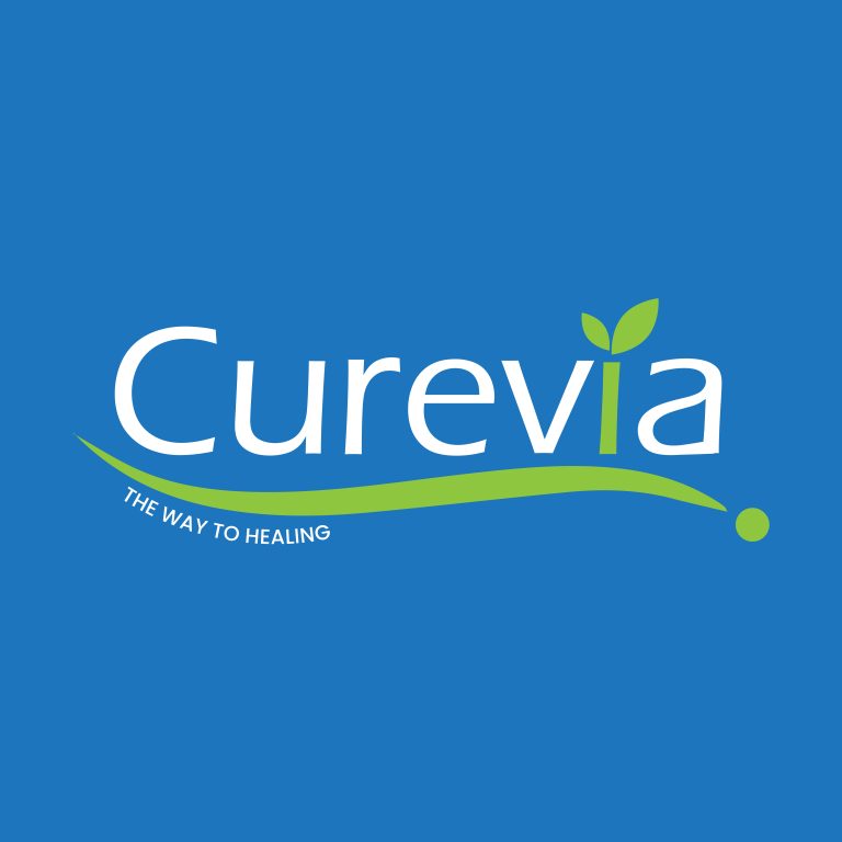
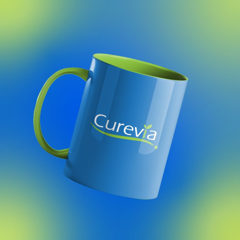
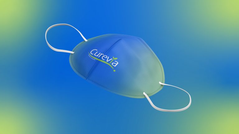
This logo was designed to represent Curevia’s core focus on healing, care, and natural well-being. The smooth flowing line symbolizes a gentle healing journey, continuity, and progress toward better health, while the green leaf element reflects nature, growth, and renewal. The blue typography conveys trust, reliability, and medical professionalism, creating a sense of safety and confidence for patients. Together, these elements communicate Curevia’s purpose of providing a clear, calm, and trustworthy path to healing, aligning with the tagline “The Way to Healing.” The objective behind this logo is to visually express compassion, balance, and long-term wellness through a simple and approachable identity.